The calendar in view mode includes a number of different sections that are controllable both through edit mode (display or not) and the advanced layout options (where to display). There are six sections to each view of the calendar page whether the calendar be in day, week or month mode or be graphical or non-graphical. Only the Calendar section will change with the view selected by the user. Each of the sections is described below with their default layout location. These layouts do not apply to the Advanced Search, Search Results, Event Detail, Event Creation or Email Event screens.
If the content provider has entered text in the Introduction and Conclusion editor windows of the calendar page, the text is displayed at the very top (Introduction) and the very bottom (Conclusion) of the Calendar page. It is recommended that the calendar administrator provide information on how to use the calendar here.
This section contains the filtering and searching options used for finding events and event information.
The category filter allows the user to select from the current categories. Selections made here filter the events displayed on the Calendar. Categories that have had the “include in search” control deselected in edit mode are not displayed.
If the Calendar has no defined categories, all categories not flagged as private will appear in the dropdown.
If the content provider has enabled the keyword search, the search field is displayed. By default the search field is displayed on the right of the screen.
If the content provider has enabled the link to the advanced search, the link must be displayed to the right of the keyword search box.
The text and the search button in this section have their own CSS class and the filter and search functions each have their own tag in the advanced layout options of the page edit mode.
This section is only displayed if the content provider has elected to display featured events. The section contains a section header which has its own CSS class and has its own tag in the advanced layout options in edit mode. Featured events are displayed beneath the section header.
If an image is associated with the event, it is displayed as a thumbnail to the left of the event text. The thumbnail has a fixed width of 45 pixels and an unspecified height value in order to maintain its aspect ratio. The featured event currently being displayed is shown to the right of the image, and is left justified.
The title of the event is shown at the top of the event in the following format:
Date – the date format is defined by the date format entered by the content provider in edit mode.
Time – the time of the event is displayed as a 12 hour clock.
Event Title – the event title is displayed as a hyperlink to the event page itself.
Recurring Event – if the event is a recurring event and the content provider has elected to display the recurring event icon, it is displayed to the right of the event title.
Download to Outlook or iCal – if the content provider has allowed the downloading of events to personal calendars and the action has not been restricted to the event pages only, the save icon is displayed to the right of the event title. When the save icon is selected, the user is presented with an option to save to Outlook or iCal. The selection will determine the type of file downloaded.
Event Duration - If the content provider has elected to display event duration it is displayed to the right of the event title.
Event preview - If the content provider has elected to display a preview of the event, the preview is displayed below the title line. Following the specified number of preview words, a “more…” hyperlink must be displayed that link the user to the event details page.
This section is only displayed in the content provider set it for display in edit mode of the calendar. The calendar controls section contains the following features:
Day/Week/Month selector – this control displays links to each of the different views of the current calendar. Any or all of these selectors may be hidden depending on the available views defined in edit mode. If only one view is enabled in edit mode, this control is not displayed.
Calendar Type Selector – this control is an icon which allows the user to switch between the graphical and non-graphical views of the calendar. The icon is not displayed unless the content provider has elected to display the links to the alternate calendar modes.
Submit a New Event – this control is displayed for users who do not have permissions for the syndicated event page. They can create an event but they can only do so using a pre-formatted event form and once they are finished, the event is submitted for approval to the calendar administrator.
Add a New Event – this link is displayed instead of the Submit a New Event, if the user adding an event has permissions to the syndicated event page. The “Add a New Event” link takes the user to edit mode of a new syndicated event page type (instead of the pre-formatted event form).
Jump to – this control provides drop-down boxes where the user can select a specific date to jump to on the calendar. This control defaults to the current date. Entering a new date jumps the calendar to the selected date in whatever view (day/week/month) and mode (graphical/non-graphical) the calendar is currently in. The day gets highlighted with the color defined by the content provider as the selected day color.
The day/week/month control, the type selector (graphical or non-graphical), the “submit new event” link and the “jump to” control must all be given their own individual tag in the advanced layout options in edit mode.
The following features apply to all events in the Calendar with the exception of the Graphical Month View.
If an image is associated with the event, it is displayed as a thumbnail to the left of the event text. The thumbnail has a fixed width of 45 pixels and an unspecified height value in order to maintain its aspect ratio. The event is displayed to the right of the image but still left justified.
The title of the event is shown at the top of the event in the following format:
Date – the date format is defined by the date format entered by the content provider in edit mode.
Time – the time of the event is displayed as a 12 hour clock.
Event Title – the event title is displayed as a hyperlink to the event page itself.
Recurring Event – if the event is a recurring event and the content provider has elected to display the recurring event icon, it is displayed to the right of the event title.
Download to Outlook or iCal – if the content provider has allowed the downloading of events to personal calendars and the action has not been restricted to the event pages only, the save icon is displayed to the right of the event title. When the save icon is selected, the user is presented with an option to save to Outlook or iCal. The selection will determine the type of file downloaded.
Event Duration - If the content provider has elected to display event duration it is displayed to the right of the event title.
Event preview - If the content provider has elected to display a preview of the event, the preview is displayed below the title line. Following the specified number of preview words, a “more…” hyperlink must be displayed that link the user to the event details page.
The graphical monthly view of the Calendar is arranged with a single cell across the top with a grid of day arranged below. The top row in the grid contains the day of the week beginning with Sunday and ending with Saturday. The size of each cell in the grid is defined by the content provider in edit mode.
The number of columns in the grid is fixed at 7 but the number of rows is determined by the number of days in the month. Each day of the month has its own cell, therefore the number of rows can vary between 5 and 6. Each cell contains a hyperlink to the day view for the day the cell represents.
If the content provider has elected to highlight days with events, the cells that represent those days is highlighted with the selected color. If the content provider has elected to highlight the current date, the cell for the current date is highlighted in the selected color. If the content provider has elected to highlight the selected date (defined by the “jump to” value), the cell for the selected date is highlighted in the selected color. Cells that contain no date value are highlighted with the color defined in edit mode for such days.
The top-most single-cell row contains the month in the following format: September 2008. This row also contains a “previous” and “next” control to allow users to browse other months from the month view of the calendar.
This section describes how events are displayed on the graphical view of the monthly calendar.
The event title is displayed on a single line within the day cell on the monthly calendar. The title is then displayed as a hyperlink to the event itself. The title does not wrap but rather is truncated with a “…” at the end of each line if the title exceeds the cell width.
Recurring Event – if the event is a recurring event and the content provider has elected to display the recurring event icon, it is displayed to the left of the event title.
Download to Outlook or iCal – the download to Outlook or iCal is NOT displayed in the monthly calendar.
The time of the event, the event image and the preview text are NOT displayed in the monthly calendar.
If the event has been highlighted either for its entire category or on an individual basis, the highlighting must be displayed around the text of the event title.
Calendar events are not displayed on any calendar if the event is part of a category marked as private or if the event is marked as private itself, unless the user viewing the calendar is logged in and is a part of the group/users defined in edit mode for the category or event.
The graphical day view of the Calendar is arranged with a single cell across the top with two columns arranged below. The left-most column displays the hours of the day in the format: 8:00 AM. Each row has an hour displayed, starting with the hour defined in edit mode as the Start Time and ending with the hour defined in edit mode as the End Time. If there are events that lie outside of the defined time range and the content provider has elected to extend the view in such cases, the table and time ranges must expand to accommodate those events.
Each alternating hour row must is highlighted with the color #E6E6E6. This coloring has a CSS class so it can be edited by a designer.
The right-most column is divided into half hour increments.
Events are placed in the cell based on the event start time where the event start time is greater than or equal to the cell time value and less than the next cell time value increment. (example: an event at 9:15 must be placed in the 9:00 cell and not the 9:30 cell).
The top-most single-cell row spans both columns and contains the date value in the format: September 29, 2008. This row also contains a “previous” and “next” control to allow users to browse other days from the day view of the calendar.
The graphical week view of the Calendar is arranged with a single cell across the top with a single column arranged below. The single column contains a date header for each day of the week with the events on that day arranged below the header. The header uses the format: Monday, September 29, 08. If the content provider has elected to highlight the current date, this header is highlighted with the selected color.
If the content provider has elected to show all dates and not just those with events, all days of the week are listed. Those dates without events display the following message: “There are no scheduled events on this date”.
Events are listed chronologically from oldest to newest in the day on which the event falls.
The top-most single-cell row contains the week range in the following format: September 28 – October 4, 2008. This row also contains a “previous” and “next” control to allow users to browse other weeks from the week view of the calendar. The week range is defined as Sunday to Saturday with the listed days and the week range both following suit.
The non-graphical day view of the Calendar is arranged with a date header across the top with events listed below. The date header has the format: September 29, 2008. The header section also contains a “previous” and “next” control to allow users to browse other days from the day view of the calendar.
All calendar events for the date are listed below the header without using table formatting.
The non-graphical week view of the Calendar is arranged with date range header across the top with day sub-headers and events arranged below. The week range in the header is displayed in the following format: September 28 – October 4, 2008. The header also contains the “previous” and “next” controls to allow users to browse other weeks from the week view of the calendar. The sub-header day uses the format: Monday, September 29, 2008.
If the content provider has elected to highlight the current date, this header is highlighted with the selected color.
If the content provider has elected to show all dates and not just those with events, all days of the week are listed.
Those dates without events display the message: “There are no scheduled events on this date”.
Events are listed chronologically from oldest to newest in the day on which the event falls.
The week range is defined as Sunday to Saturday with the listed days and the week range both following suit.
The non-graphical month view of the Calendar is arranged with month/year header across the top with day sub-headers and events arranged below. The date header is displayed as: September 2008. The header also contains the “previous” and “next” controls to allow users to browse other months from the month view of the calendar. The sub-header day uses the format: Monday, September 29, 2008.
If the content provider has elected to highlight the current date, this header is highlighted with the selected color.
If the content provider has elected to show all dates and not just those with events, all days of the week are listed.
Those dates without events display the following message: “There are no scheduled events on this date”.
Events are listed chronologically from oldest to newest in the day on which the event falls.
The Event listing page does not display the calendar controls at the top of the calendar. If the content provider has elected to group events by date, a sub-header is displayed as: Monday, September 29, 2008. Applicable events are listed below the sub-header.
If the content provider has elected to not group by date, the sub-headers are not displayed and only the events are listed and only the next X number of events are displayed as defined by the content provider in edit mode.
Calendar administrators can set a calendar to allow both logged-in and anonymous (not logged in) users to submit events. The event submission page is slightly different for each of these two types of users.
The anonymous user event submission page appears much like the following:
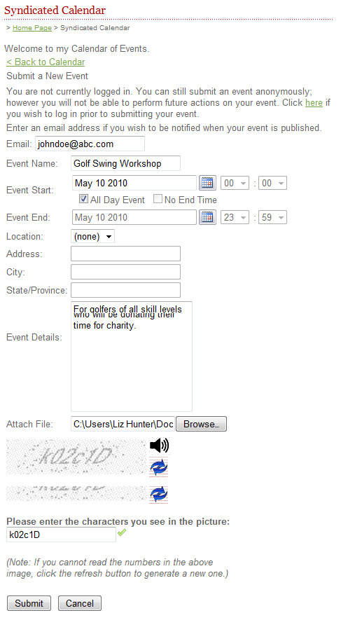
Note the paragraph at the top that warns users they are not currently logged in. This is to remind those users who have a valid log in to log in before creating an event so they will be able to edit the event at a later date. Anonymous events cannot be accessed once they are submitted by the anonymous user.
Logged-in users: For users who log in with a valid userid and password, there are two possible pages for submitting articles. If the logged-in user has edit rights to the calendar page, and Event Page in Edit Mode will be displayed for the user to add the event. If the user does not have rights to edit the calendar, they will see a form much like the one for anonymous users. The difference will be that the message at the top saying they should log in will not be displayed.
Notes regarding Even Submission:
An event submitted by a user must be reviewed by the calendar administrator. Upon approval, the submitted event becomes a syndicated calendar event page that has been published. Upon rejection, the submitted event is removed from the system.
When an event is submitted, the calendar administrator receives an email notification containing the event details and the ability to approve or reject the event. The subject of the email is “Event Submission – Event Name” where the event name is the value entered by the user in the submission form. The body of the email is defined in the Email Notification section of this document.
If the content provider has granted edit and remove permission to the end user, approval of the event will grant view mode edit and remove permissions for that event, to the user who submitted the event.
In the case of both approval and rejection, the user receives an email notification of either action
If you are using RSVP forms with your calendar events and you have set the syndicated calendar page to allow publicly-submitted events to have an RSVP form attached, then public users (not anonymous but those with a public user login) submitting events will be able to attach an RSVP form to their event submission
If a user has submitted an event and has been given the ability to edit the event details or remove the event from the calendar, they can do so in the same screen as the event submission form. Changes to or removal of an event must go through the same approval process as the submission of an event.
Removal of an event archives the syndicated calendar event page if approved by the calendar admin.
Editing an event republishes the syndicated calendar event page with the changes made if the changes are approved by the calendar admin
The calendar search searches all events associated with the current calendar including events specific to the calendar, events that originate from other calendars in the same ACM installation and events that originate on calendars in other instances of ACM.
The search only searches those events that match categories that have been defined in edit mode.
The search excludes events flagged as private unless the user performing the search has been selected as being able to view the private event
Users can search by keyword from the main calendar landing page. The keyword search looks in the event name (page title), location field (including all address fields and the place field) and the event details of each syndicated calendar event page.
Users may use an advanced search with the following search criteria:
Keyword Search – uses the same search function as described above.
Category Filters – the user must be able to multi-select from a number of categories that have been defined for the current calendar. Categories flagged as private are not displayed unless the user viewing the calendar is logged in and is a part of the group/users defined in edit mode for the category.
Date Range – users can search for events within a certain date range. The default date range must be from current date to current date.
Time Range – users can search for events within a certain time range. The default time range is from 12:00 AM to 11:59 PM.
This section describes how search results are handled on the published calendar page.
Search results are displayed in the default order defined in edit mode. Users can re-order the results by relevance, by title or by event date and time. For title, the order is alphabetical starting with A. For Event Date and Time, the order must be from oldest to newest.
If enabled in edit mode the events will display the event image thumbnail and the event preview text.
If the calendar administrator has enabled the emailing of events, calendar users can email them as follows:
When the user elects to email an event, they are directed to the email event screen where they can enter the following information: their name, the recipients' name(s), the recipients' email address(es).
Users can enter a custom note to be sent along with the email. This field does not support HTML.
Users must then enter a CAPTCHA.
The details of the event are listed at the bottom of the email screen.
Sending the email results in the following message: “Thank you, the event has been sent by email.”